Solved UX issues identified
during usability testing
Average user satisfaction
measured on App Store
Modernized frontend without backend disruptions
I spearheaded the UX/UI redesign of the myGLS app, tackling usability issues
to create an intuitive experience for parcel sending, easy pickups, and remote locker interactions
Join thousands on a journey to a more centered, focused, and fulfilling life.
I spearheaded the UX/UI redesign of the myGLS app, tackling usability issues
to create an intuitive experience for parcel sending, easy pickups, and remote locker interactions


I applied a user-centered, delivery-friendly process combining UX audits, usability testing, and fast prototyping.
This ensured we addressed the biggest pain points while aligning with development constraints
Join thousands on a journey to a more centered, focused, and fulfilling life.
I applied a user-centered, delivery-friendly process combining UX audits, usability testing, and fast prototyping.
This ensured we addressed the biggest pain points while aligning with development constraints
USABILITY TESTING

Users consistently skipped the parcel quote tool because they didn’t understand how size tiers work. By visualizing parcel sizes and adding examples, we turned a blocker into one of the most-used features
KEY FINDING
The old home screen overwhelmed users with too many options. Refocusing the layout around tracking and sending parcels reduced confusion and boosted task success by over 30%
KEY FINDING
UX WORKSHOPS
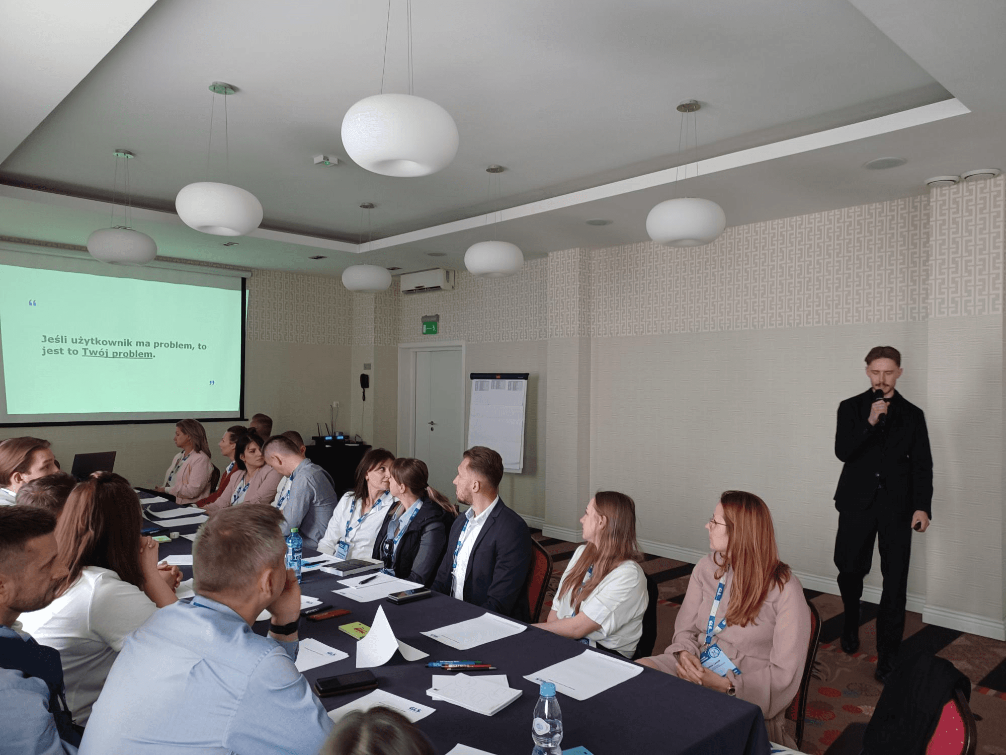
Many product decisions were made without user context, causing misalignment and rework. By introducing discovery tools and shared frameworks, we enabled teams to anchor decisions in real user needs
BUSINESS OUTCOME
Evangelizing UX at the C-level helped secure strategic buy-in. With top-down support, we institutionalized user research, made UX a repeatable process, and ensured it was prioritized from roadmap to release
BUSINESS OUTCOME
USABILITY TESTING
Users consistently skipped the parcel quote tool because they didn’t understand how size tiers work. By visualizing parcel sizes and adding examples, we turned a blocker into one of the most-used features
KEY FINDING
The old home screen overwhelmed users with too many options. Refocusing the layout around tracking and sending parcels reduced confusion and boosted task success by over 30%
KEY FINDING
UX WORKSHOPS
Many product decisions were made without user context, causing misalignment and rework. By introducing discovery tools and shared frameworks, we enabled teams to anchor decisions in real user needs
BUSINESS OUTCOME
Evangelizing UX at the C-level helped secure strategic buy-in. With top-down support, we institutionalized user research, made UX a repeatable process, and ensured it was prioritized from roadmap to release
BUSINESS OUTCOME
The old app lacked structure and clarity, creating friction for both users and the development team.
I stripped away noise, reorganized the flow, and delivered a system that's easier to use – and easier to build
Join thousands on a journey to a more centered, focused, and fulfilling life.
The old app lacked structure and clarity, creating friction for both users and the development team.
I stripped away noise, reorganized the flow, and delivered a system that's easier to use – and easier to build
Cluttered UI with generic messaging - low clarity and poor engagement
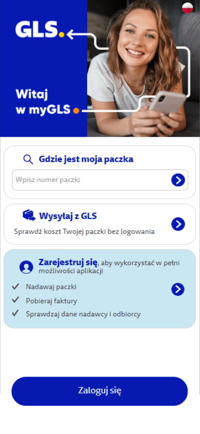

Minimal interface focused on action - users find core options faster and return more often
Manual data input required - confusing form fields led to user drop-off

Predefined parcel sizes simplify the process and increase conversion
Users had to manually scan through cluttered fields to find basic info

The new layout prioritizes info - making it easier to track parcels, repeat actions, and navigate back
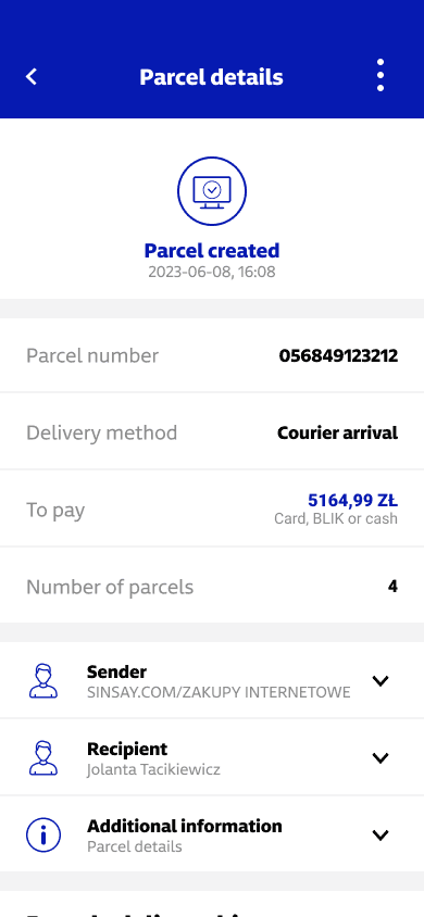
Cluttered UI with generic messaging - low clarity and poor engagement
Minimal interface focused on action - users find core options faster and return more often
Manual data input required - confusing form fields led to user drop-off
Predefined parcel sizes simplify the process and increase conversion
Users had to manually scan through cluttered fields to find basic info
The new layout prioritizes info - making it easier to track parcels, repeat actions, and navigate back
Solved UX issues identified
during usability testing
Average user satisfaction
measured on App Store
Modernized frontend without backend disruptions